Research: Art of the Title - Little Women
Little Women Film Opening
In this 1994 adjustment of Louisa May Alcott's work of art, the March sisters go up against developing torments, money related deficiencies, family catastrophes and romantic rivalries in mid-nineteenth century Massachusetts. Jo (Winona Ryder) battles for autonomy and here and there conflicts with her dearest mother and her sisters Meg, Amy and Beth. She likewise fights with their irritable Aunt March, their indiscreet neighbour Laurie (Christian Bale) and generous semantics educator Friedrich Bhaer (Gabriel Byrne).
In the opening to Gillian Armstrong's adaption of Little Women, decoration and art establish the framework for the account of Jo and Beth and Meg and Amy and their home in Concord, Massachusetts.
Camerawork
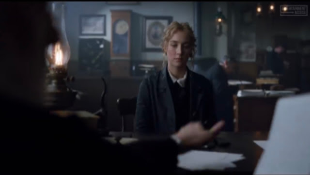
The (establishing) opening shot (see image above) is simplistic but still effective. The mid-frame shot of the main character (Jo March – Saoirse Ronan) create a subtle first opening. The symmetry of the girl in the middle of the frame and the writing on either side “New York City” and the other writing on the other sides creates a satisfying opening to the movie. We can also identify the rule of thirds within this first shot, it shows that every element that features on the intersecting lines is of upmost importance – for example: the translucent lines on either side of the girl standing in front of the door. The camera angle is placed at eye-level so that we can see the whole frame.
Mise en-scène
Location: The first shot is in the Weekly Volcanoes Office. The film was shot in 11 Massachusetts municipalities and a few of the sets were even built from scratch. The March family’s home, for example was temporarily built house on a property in Concord rather than the historic orchard house
Production Design: Production designer for this film was Jess Gonchor. His thoughts on the production design was to making an old tale feel new.
In the past (time period in the opening) the lighting feels glowing and warmer, but in the present (time period in the opening) the lighting seems cold and grey.
Sound: At the very beginning we can hear the non-diegetic sound of people in the background moving around and the main character breathing heavily before she opens the door. These sounds create a dramatic entrance and builds tension before she opens the door to the busy atmosphere where her teacher is in the office. There is a long pause before she dramatically unlocks the door (non-diegetic sound) and once she is in the office, we can hear mumbling of other people in the room which creates a sense of a bust atmosphere.
The diegetic sound in the opening where Professor Bhaer (the teacher sitting behind the desk, see image above) is making various sounds that we can see, for example: the slamming of the paper, the scratching sound with the pen and paper and the passing of the money.
At this section of the opening scene I noticed that there is such a nice sense of slow placed scenes intermixed with faster-paced scenes. I was thinking of an earlier section where there’s kind of stately montage of the house and the piano, the stage play and then the pace picks up considerably as Jo goes to some kind of dance (see image above, this was called the beer hall. In the beer hall scene, there’s diegetic music that they dance to, then it transitions to score as the emotion of the movement takes over.
Typography:
The title sequence, created by Australian designer Belinda Bennetts, features credits typography set atop woodblock illustrations and calligraphic ornaments, flourishes with graceful curves over fields of snow. The illustrations chosen by Bennetts depict a woman hunched over a book, piles of books, grapevines, and a woman’s hand in the midst of writing, establishing the world of the March sisters. The blue, black and white colour scheme creates a cold and somewhat eerie image.


